When we are learning HTML CSS JavaScript then we need to practice a lot. If we do not learn to run the code correctly then we may face problems. If you want to improve your skills then you need to practice the code properly. So I have created a beginner friendly project for you in which you can understand JavaScript properly. See how JavaScript works. When you are learning coding from the beginning then you have to create a normal simple project so that you can understand how the code works and how the errors occur. These are solved if you create a big project directly then you may face problems. When you have good knowledge of coding then you can create big projects, so let's understand the code step by step.
Index.html
To create any project, first of all you have to take the help of HTML, without HTML you cannot create a project, so we will proceed step by step, first of all we will create the structure of our project with the help of HTML.
- <h1>: First of all we have set the title of our project with the help of h1 heading, you can set the title heading as per your requirement.
- <div>: After this we have created a div box inside which we have created our toggle button.
- <input>: First, we created a checkbox using the input key to toggle the dark and light modes.
- <i>: In this we have created two different icons, one of moon and one of sun, like if you set the light mode then sun will be shown and if you set it to dark then moon will be shown.
- <span>: We have created a ball with the help of snake which will show toggle animation which looks quite interesting.
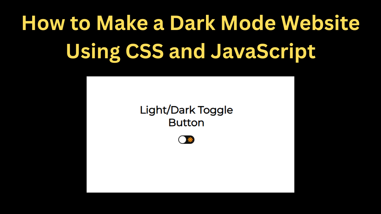
<h1>Light/Dark Toggle<br> Button</h1>

<div>
  <input type="checkbox" class="checkbox" id="checkbox">
  <label for="checkbox" class="checkbox-label">
    <i class="fas fa-moon"></i>
    <i class="fas fa-sun"></i>
    <span class="ball"></span>
  </label>
</div>

<!--  Support me if you like it -->
<div class="support">
	<a href="https://twitter.com/Umer_Farooq70" target="_blank"><i class="fab fa-twitter-square"></i></a>
</div>Style.css
Now we have created the structure of the theme toggle button using HTML. Now we have to design it because the design is not looking right yet, so now we are going to design it using CSS.
- body: First of all we have added font family in body in which we have used sans-serif font.
- We have used white color in the background of the body and flexed the display along with keeping the content centered.
- After this, we have kept the height full and used transition so that when the button is toggled, a smooth animation is shown to the user.
- checkbox: We have kept the passivity of the checkbox as 0 and the positive as absolute.
- We have also added width and height to the checkbox which is 50px. We have also added a border radius of 50px.
- Ball: We have added a ball to the button in which we have used transform property in which when user selects dark mode it will animate to the left and same will happen in light mode also.
So this is how we've styled our dark mode button. Creating it is quite easy, you just need a little coding knowledge.
@import url("https://fonts.googleapis.com/css2?family=Montserrat&display=swap");

* {box-sizing: border-box;}

body {
  font-family: "Montserrat", sans-serif;
  background-color: #fff;
  display: flex;
  justify-content: center;
  align-items: center;
  flex-direction: column;
  text-align: center;
  min-height: 100vh;
  margin: 0;
  transition: background 0.2s linear;
}

body.dark {background-color: #292c35;} /* #9b59b6 */

body.dark h1, body.dark .support a {color: #fff;}

.checkbox {
  opacity: 0;
  position: absolute;
}

.checkbox-label {
  background-color: #111;
  width: 50px;
  height: 26px;
  border-radius: 50px;
  position: relative;
  padding: 5px;
  cursor: pointer;
  display: flex;
  justify-content: space-between;
  align-items: center;
}

.fa-moon {color: #f1c40f;}

.fa-sun {color: #f39c12;}

.checkbox-label .ball {
  background-color: #fff;
  width: 22px;
  height: 22px;
  position: absolute;
  left: 2px;
  top: 2px;
  border-radius: 50%;
  transition: transform 0.2s linear;
}

.checkbox:checked + .checkbox-label .ball {
  transform: translateX(24px);
}

/*  Support me if you like it */
.support {
	position: absolute;
	right: 20px;
	bottom: 20px;
}

.support a {
  color: #292c35;
  font-size: 32px;
  backface-visibility: hidden;
  display: inline-block;
  transition: transform 0.2s ease;
}

.support a:hover{
  transform: scale(1.1);
}Script.js
Now we have made our button absolutely perfect with the help of HTML and CSS but do you know whether it works or not, the answer is no it does not work yet, with the help of HTML we create the structure and with the help of CSS we design and after doing all this we make it work with the help of JavaScript, so let us understand what JavaScript code we have written.
- getElementById: First, we copy the Id of the checkbox and add it to our JavaScript code.
- addEventListener: Next, we added an eventlistener that will change the theme style when the button is toggled.
- toggle: Then in the last we have linked the toggle button so that our toggle button becomes completely working.
So this is how we created our button, using just three lines of JavaScript.
const checkbox = document.getElementById("checkbox")
checkbox.addEventListener("change", () => {
  document.body.classList.toggle("dark")
})